
Now, keep in mind I'm not an expert and I might be going about things all wrong. It won't hurt my feelings at all if you know of a better way and comment about it. As a matter of fact, I encourage it! LOL.
For the last design I finished, I wanted a watercolor effect. I debated on buying some watercolor supplies and doing some brushstrokes the old school way, but I would have to clean up my office in order to make room for that project. So instead I just spent hours and hours tweeking different brush settings. I found a lot of tutorials that required you to download brushes, but I didn't want something to use like a stamp. I wanted something that would allow me to simulate painting with a brush. I'm still hunting the perfect settings, but I'm getting closer.
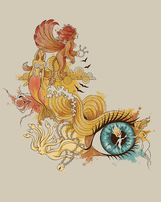
The following instructions will help you achieve a brush stroke similar to this: I use Photoshop CS, btw.

In the original brushes that came with CS and CS2, choose the one that looks like the one that says 100. See below:

In the "Brushes" tab in the top right, choose the following settings:
Shape Dynamics: Minimum Diameter 20%. Everything else 0
Texture: Choose "Molecular"
Duel Brush: Follow this pic:

Other Dynamics: Opacity Jitter: 26%, Flow Jitter: 20%
Wet Edges: Checked
Smoothing: Checked
Keeping one color per layer, and using that brush, paint away. Since it's a bit transparent, paint over your strokes and the overlapping parts will be darker.
*Edit: You may need to adjust the over all opacity of the brush stroke as well. I can't recall if I did this or not, but I think I did.
If you plan on submitting this to a site that does NOT offer simulated process printing, you'll need to convert each layer to a bitmap.
Here's my process:
Create a new file the same size as what I'm working on. CMYK is fine. 300 dpi.
Drag a layer onto it
Flatten it
Desaturate it
Adjust Brightness and Contrast until you're pleased with the lights and darks
Change mode to Grayscale
Change mode to Bitmap: Output 300px per inch, Halftone Screen, frequency 40 lines per inch, angle 45 degrees, shape cross.
(Keep in mind the website's printing capabilities. They're all different. You may have to do less lines per inch.)
Change mode back to Grayscale
Change mode back to CMYK
Unlock layer by double clicking
Select Color Range -->Shadows
Select Inverse
Delete
Change Color Overlay Layer Style to match what color you need it to be.
Put it back in your original file.
The finished version will look similar to this:

Just repeat these steps for each color. I hope this was useful, and please let me know if I'm informing incorrectly. Please check out the finished design here at Shirtfight! :)
The Eye is the Window


4 comments:
awesome post, I've been thinking about learning how to do this for a while :-)
thank's for share this techniche!
i just love your style.
a killer design!
thanks for sharing
This is so awesome. I've been trying to figure out how to make a watercolor effect for some time. Thanks so much for sharing your method. :)
Post a Comment