I've heard it said that to be a good writer, one must also be well-read. I believe the same is true for artists. In my opinion, it's a good investment of time to keep up with various sites and the artists and designs that they feature. It's also good to score and vote for designs to see what could be breaking through in the future. Doing so really helps me define styles and mindsets to experiment with later. It's almost like keeping a pantry stocked with key ingredients. Want to make an oversized character collage? How about mixing MissMonster's line quality with Wotto's facial expressions and RecycledWax's color combination? Infuse your own personality in it, and you might have one delicious meal. Now you guys should know I don't mean straight-up copy people. It just helps to clarify in your mind how to approach a new design instead of just staring at a blank screen for hours trying to force magic to happen.
With all this in mind I'd like to take the time to feature two designs that I find myself going back to frequently. They are each done by a different artist and each artist is consistant in creating skillful and inspiring pieces. The first is Mother of the Sea by the very clever and talented Flying Mouse. I love, love, love Mermaids, so that might have weighted my affection for this, but aside from that it's the illustration style that keeps me coming back to it. I think it's the fine brown inking that I like the best. One day I'd like to achieve a drawing with the fine detail and quality of this.

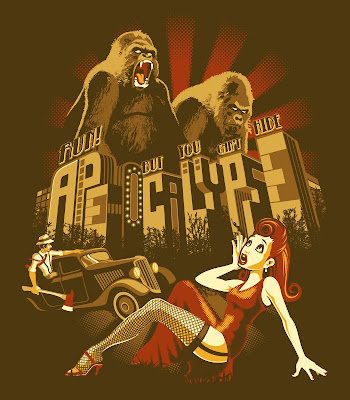
The next design is by Leon Ryan. The first time I looked through his portfolio site I just sort of sat there with my mouth gaping open for a few minutes. Here, look at it--you'll see what I mean: http://www.leonryan.com/ I couldn't find the title for this piece, but I'm thinking it must be Apocalypse or something. Anyway I chose it because I like the 1940's look to it. I'm also impressed with how he mixed halftones, textures, and simple solid shapes without it clashing. That's hard to do. The thing I would like to learn from Leon is his use of clean, thick outlines and simple shading and highlighting. He can do a lot with a limited color palette, and that comes in handy when creating possible shirt designs.

Those are just two I pulled out of my mental vault. There are many more that inspire me. The only drawback to this method of inspriration I have found is that sometimes it's hard to define your own style. I struggle with this, and I've heard others mention they struggle as well. The only consolations I can come up with is that it will come in time, and maybe it's good to not be a one trick pony.
Do you feel too overwhelmed and don't know where to start browsing? I know of two individuals who have exquisite and cultivated yet cutting-edge taste in the tee shirt design genre: AdderXYU of SingulariTee and MJ (aka geekfactor12) of compete-tee-tion. Until you get the hang of it, I can honestly say you can trust them to find the good stuff for you. I've given them a permanent spot over there to the left so you can easily find them.
Well I'm just too selfish to end this without mentioning my own stuff, so here's the latest. ;P Shirt.Woot's Do-Over Derby is going on right now, and somehow I have six designs in there. Only five actually got Honorable Mentions so I guess they just couldn't get enough of me and threw another in there. I wish Woot voters couldn't get enough of me because at this moment, none of my designs are in the top ten. Wanna help them out? Here are some links:
The Rabbit's Weird Dream
Eel Charging Station
Inspired by Dr. Who
Kung Fu Hangout
The Weeping Willow
The Last Unitops
Shirtfight's latest and greatest theme is Video Games vs ?. I fortunately had a design partially done for this so I changed it up a bit and let'em have it. Yes, I know she looks like a poster child for Hot Topic, but at least it's got some WWII nose art flare to it, right? See, a guy could wear it so he could impress his friends with the blatent display of T & A, and a girl could wear it to show that she's cool enough to wear a gamer shirt. Win-win. Score quickly if you like it, 'cause this contest ends Thursday.

I also put a couple of designs at Teextile. One is the oldie-but-goodie Carbon Butterfly and the other is the newer Raining Cats and Dogs. Check them out over there with all my other cool stuff on the left.
Okay, it's taken half of my Sunday to write this, so I better stop, lol. See, that's why I only update around once a week. I can be extremely thorough with OCD tendencies. As always, thanks for stopping by. :)


No comments:
Post a Comment